
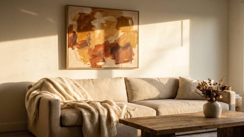
An empty stretch of wall above the sofa is one of the most common living room complaints homeowners bring up, and it’s usually the last thing anyone budgets for after a renovation. You get the furniture right, the paint color settled, the rug down, and then the wall just sits there looking unfinished. In 2026, the fix most designers are reaching for isn’t a cluster of small frames. It’s one oversized piece that does the job on its own.
This guide walks through why that shift happened, how to size a piece so it actually fits your sofa, which colors and textures are working right now, and what to do if your living room is small or your ceilings are low. By the end, you’ll know exactly what to measure before you buy anything.
Why 2026 Favors One Big Statement Piece Over a Gallery Wall?
For years, the go-to living room formula was a gallery wall: six, eight, sometimes a dozen small frames arranged in a grid above the sofa. It photographed well, but it also meant constant fussing with spacing, leveling, and swapping pieces in and out. That formula is losing ground fast. The global wall art market is now worth an estimated $67 to $71 billion in 2026, according to Magnetic Art’s home decor statistics report, which puts it ahead of the entire global music industry’s $28.6 billion valuation. People are putting real money into what hangs on their walls, and increasingly, that money is going toward fewer, larger pieces rather than a scattered collection of small ones.
Living Spaces’ 2026 decor trend research points to the same pattern: homeowners are swapping multi-piece gallery walls for a single oversized painting centered above the sofa, and warm neutrals like beige, taupe, and cream are replacing the cool gray minimalism that dominated the last several years. If you’re shopping for that kind of statement piece, browsing large wall art for living room options from ArtBy Maudsch shows what that one-and-done approach looks like in practice, with pieces sized to fill the space a gallery wall once occupied.
The appeal isn’t just aesthetic. One large piece is genuinely easier to live with. There’s no grid to reveal every time someone bumps the wall, no debate over which five prints go together, and no awkward gap when you eventually want to swap out one piece and the whole arrangement falls apart.
How to Size Wall Art for Your Sofa (The Two-Thirds Rule)
Buying “big” without a plan is how people end up with a canvas that looks stranded on a wall, either too small to matter or so large it overwhelms the seating below it. The rule most interior designers use, and the one worth memorizing before you shop, is the two-thirds rule: your wall art should span roughly 60 to 75 percent of your sofa’s width.
Canvas Discount’s sizing guide breaks the math down clearly. An 84- to 90-inch sofa, a common size for a standard three-seat couch, pairs well with a canvas between 56 and 63 inches wide. Go much narrower, and the piece reads as an afterthought. Go much wider, and it competes with the furniture instead of complementing it.
Height matters just as much as width. The bottom edge of the piece should sit 6 to 10 inches above the back cushions of the sofa, close enough to feel connected to the seating area, far enough to avoid looking like it’s resting on the furniture. Measure your sofa’s width and the space above it before you shop, not after. If you want a deeper dive on how a piece should relate to the rest of the room, not just the sofa beneath it, our guide to styling your living room as a whole covers the layout principles that make a space feel finished rather than assembled.
Choosing Colors, Textures, and Themes That Fit 2026 Trends
Size gets a piece on the wall. Color and texture are what make it feel intentional rather than incidental. The move toward warm neutrals, mentioned earlier, isn’t happening in isolation. It’s part of a broader pullback from the stark, cool-toned minimalism that has defined many living rooms over the past several years. Earth tones, muted terracotta, warm cream, and soft taupe are showing up far more often in 2026 living room art than the slate grays and cool blues that once dominated.
Texture is the differentiator that’s easy to overlook. A flat print and a hand-painted or dimensional canvas can be the same size and the same color palette, and still feel completely different in a room. The Mississippi State University Library’s guide to color theory in interior design explains how tone, contrast, and material interact with the way light moves through a space, which is part of why a textured piece tends to read as warmer and more grounded than a flat one, even under the same lighting.
Popular themes for 2026 lean toward landscape photography with soft, atmospheric color grading, abstract work in earth tones, and high-contrast black-and-white pieces for rooms that want a more graphic anchor. None of these are rigid rules. The point is to pick a piece whose palette pulls from something already in the room, whether that’s your rug, your throw pillows, or your wood tones, so it doesn’t feel like a separate decision from everything else. For a broader look at where interior color and material choices are heading this year, our roundup of current decorating trends worth knowing goes into more depth on the palettes gaining ground beyond just wall art.
Large Wall Art Ideas for Small Living Rooms and Low Ceilings
The most common objection to oversized wall art is that it only works in big rooms with high ceilings. That’s backward. A single large piece often makes a small room feel more finished, not more cramped, because it gives the eye a clear focal point rather than several small ones scattered across the wall.
For low ceilings specifically, orientation does most of the work. A vertical or portrait-format piece draws the eye upward and visually stretches the wall, making an 8-foot ceiling feel a bit taller without any construction. In a narrow living room, one well-proportioned canvas centered on the main wall reads as deliberate. A cluster of five or six small frames in that same footprint usually reads as clutter, especially in a room where every square foot of wall space is already doing double duty.
Before buying anything for a smaller space, it pays to shop around. Research from News.Market.us on home decor buying habits found that 75% of millennial shoppers compare multiple retailers before purchasing decor, and that millennials buy furniture and decor online 47% of the time after doing that research. That comparison habit matters even more in a small room, where there’s less margin for error if a piece turns out to be the wrong scale once it’s actually on the wall. If you’re still narrowing down what will actually suit your space, our piece on choosing art that fits your space walks through how to match a piece to a room’s proportions before you commit to a purchase.
Bringing It All Together
The living rooms that feel most put-together in 2026 aren’t the ones with the most art on the walls. They’re the ones with the right piece, sized correctly, in a color that belongs with everything else in the room. One well-chosen, well-placed piece of large wall art does more for a space than a wall full of small frames ever did.
Measure your sofa before you shop. Lean toward warm tones and real texture over flat cool-toned prints. And if your room is small or your ceilings are low, don’t shy away from scale, since a single large piece is usually the thing that finally makes the wall look intentional instead of unfinished. See more.